 Much better. No neon colors, no artificial butter scotch. If you had a closer look at the brown here, you'd see that it is quite purplish. Not quite what I was after, but I just couldn't seem to be able to dump more color into it.
The reason I got these (Sylvia's question) was to start something fair isle/intarsia. Not quite sure what, maybe this (not sure I'll get into this now that the colors aren't even close to what I was thinking about), or a pair of fair isle mittens (the more likely option). I just needed something colorful. Thankfully, I didn't purchase the Palette sampler, which I think has a ball of every color they offer. That would have been a lot of dyeing... There was a dark brown, a cream colored and a blue ball that were ok and that I didn't dye.
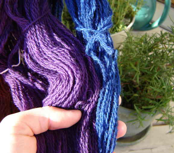
Here's a close up of the blue and purple:
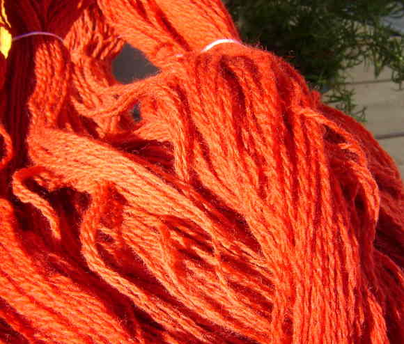
And the oranges:
About the sock pattern, I will work on the translation and post it hopefully later this weekend.
2 comments:
Infinitely better!!! You shifted the colors into such a nice, rich spectrum.
Those pillows are lovely. Thanks for posting the link. --Sylvia
I agree with the previous speaker! Also I just wanted to say congrats about your pattern in Ulla. It's really cool.
Post a Comment